Marvel Comics, a cornerstone of the superhero genre, has recently unveiled a new logo.
Instead of the excitement that usually accompanies such announcements, this rebranding has been met with widespread disappointment among fans.
A Walk Through Marvel’s Logo History
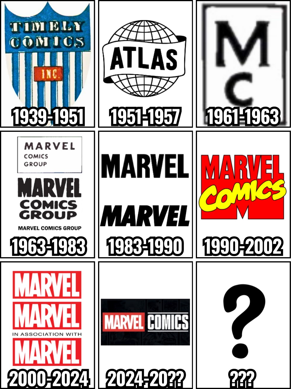
Marvel Comics has a rich history of logo changes that reflect its evolution over the decades.
Originally, the company started as Timely Comics from 1939 to 1951, and then replaced by Atlas Comics.
Although the name Marvel Comics was officially adopted in 1957, the publisher didn’t have a dedicated logo until 1961.
From 1963 to 1983, they decided to use three different “Marvel Comics Group” logos. The period from 1983 to 1990 saw two different black “Marvel” logos, and from 1990 to 2002, Marvel adopted a logo that resembled the iconic MTV logo.
The logos from 2000 to 2024 are the ones most fans are familiar with, maintaining a consistent and recognizable look with the red background and white “Marvel” text.
Now, Marvel Comics has adopted a new logo that closely mirrors the Marvel Studios logo.
The New Logo and Its Mixed Reception
The latest rebranding effort by Marvel Comics aligns its logo with the branding of Marvel Studios and Marvel Animation.
This new design essentially adds “Comics” to the classic Marvel logo, aiming to unify the different branches under a cohesive brand identity.
Hard launch 👀 Welcome to @MarvelComicsHQ, where you can find all things related to your favorite Marvel stories.
We’re talking:
• Weekly Comic Updates – Wednesday Warriors, we’re reading and reacting along with you every week.• Reading Recs – The vast Marvel Universe can be… pic.twitter.com/qhVyoq0fX0
— Marvel Comics (@MarvelComicsHQ) June 16, 2024
However, the new logo has not been well-received by many fans.
One reader commented, “Emphasizing the movies over the books feels like the wrong design for publishing.”
Another questioned the target audience, asking, “Who is that for? How many of Marvel Comics’ current readers came from the MCU? How many of the MCU fans are into comic books, or even like reading anything? And, like, how many years does Marvel expect the movies to stay relevant? At this point, it feels like it overstayed its welcome movie-wise, and the TV shows are targeting a much smaller audience.”
Concerns about the increasing influence of the MCU on Marvel Comics were also voiced.
A fan stated, “Way too similar to the Marvel Studios logo, which I fear will indicate there is more synergy to come. Bleh.”
Another noted the trend of rebranding across different media, saying, “Television, Animation, and now Comics got a logo rebrand to match Studios. Gaming is next.”